


Power KPI: Interactive Dashboards for Qlik Sense
Create responsive KPI dashboards, tables, and cards with flexible layouts and interactive controls. Power KPI extends Qlik Sense visualization capabilities, helping you present business data in line with your reporting needs and brand guidelines.

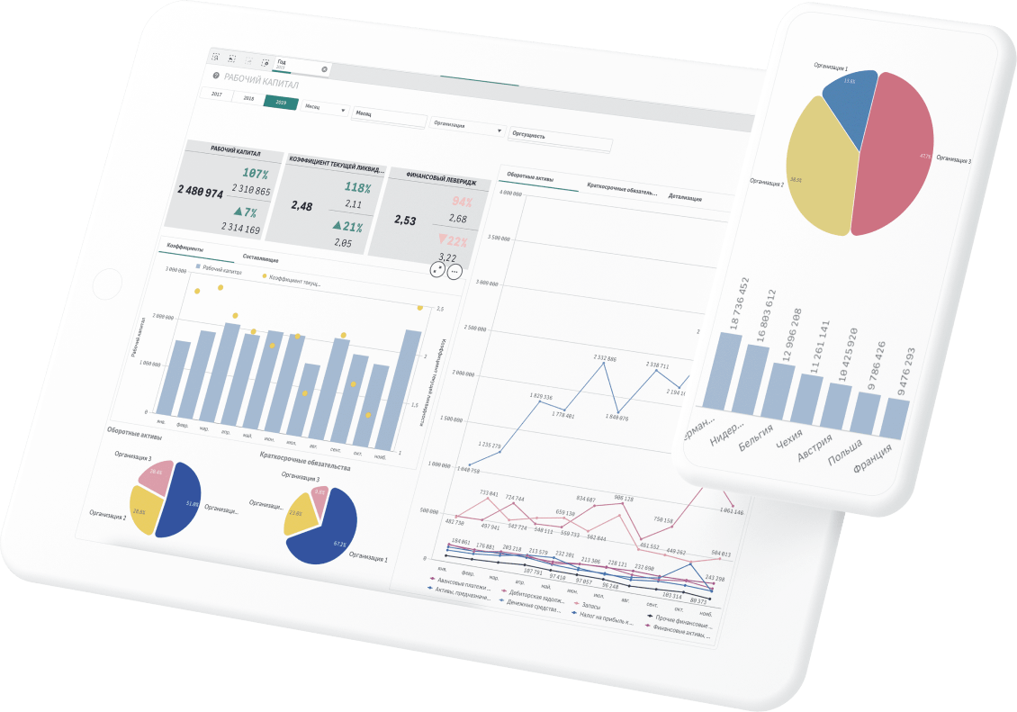

- Create custom layouts with precise control over the appearance of your Qlik Sense visualizations.
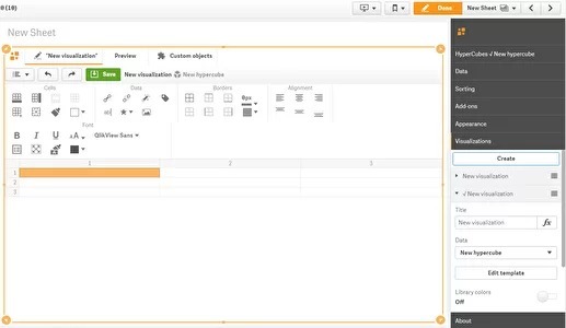
- Merge cells, adjust row heights and column widths, and format fonts, colors, backgrounds, borders, and alignment in a spreadsheet-like editor.
- Add interactive actions for navigation, selections, and access to detailed views.
- Switch between visualization templates based on conditions or user interactions.
- Design responsive views for different screen sizes, including mobile devices.
Flexible Visualization and Interaction in Qlik Sense
Power KPI combines a visual layout editor with formatting options and interactive actions. Build views that help users monitor KPIs, explore details, and navigate your Qlik Sense applications.Power KPI —универсальное средство для комплексного решения целого ряда задач:
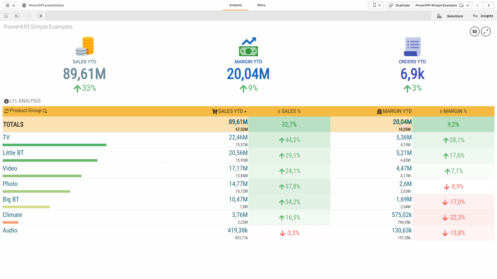
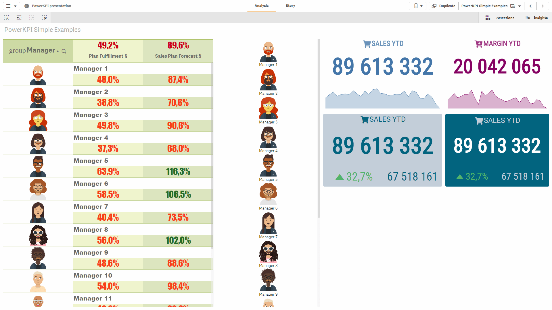
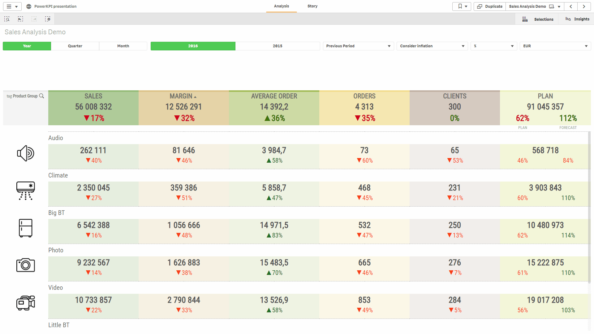
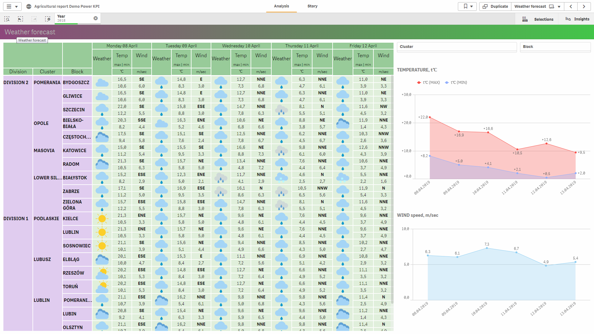
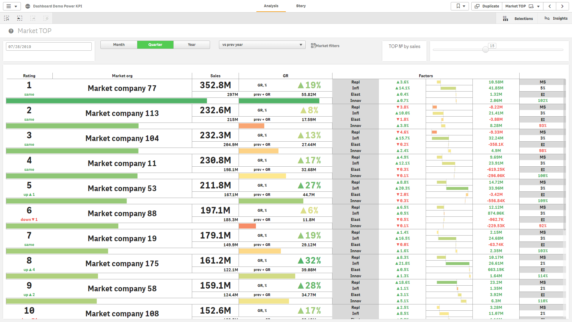
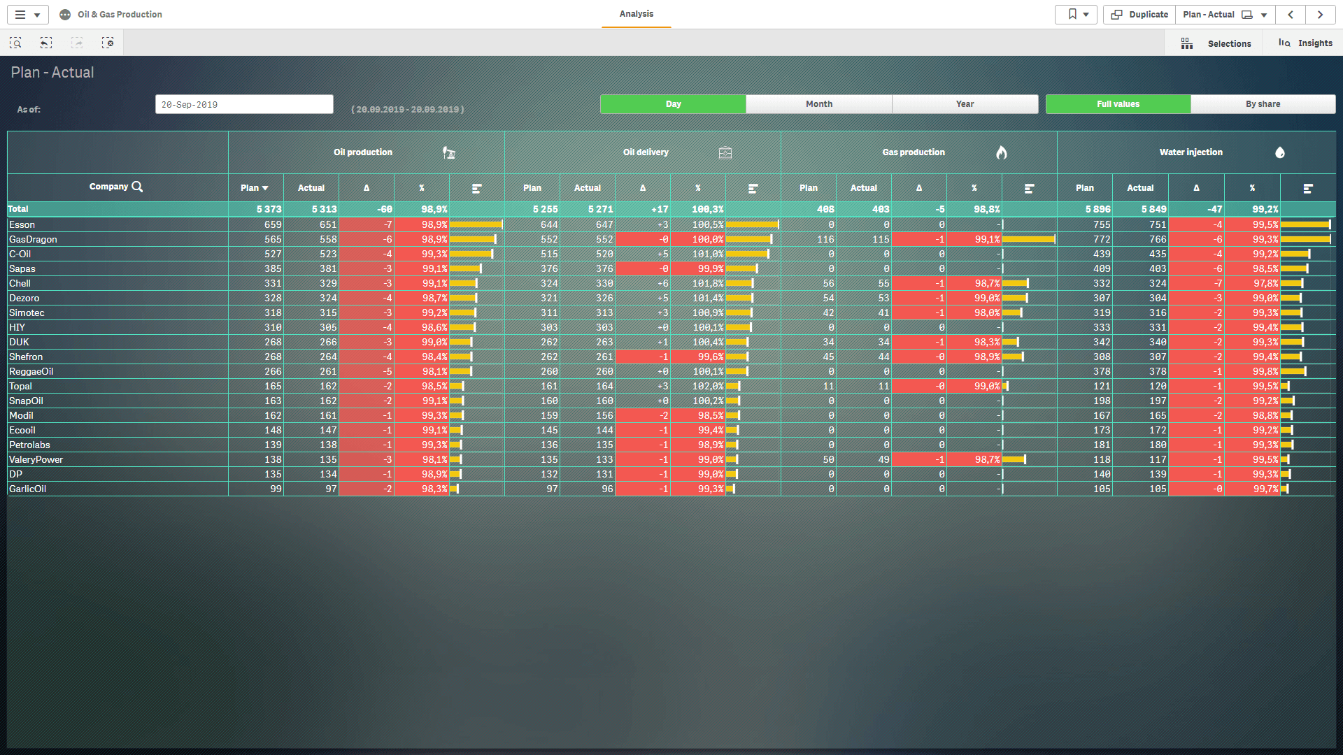
Create responsive data views that match your business requirements and brand guidelines using a spreadsheet-like visual editor. Merge cells, adjust column widths and row heights, and customize fonts, backgrounds, colors, borders, images, and alignment. Build layouts ranging from simple KPI cards to detailed table-like views with custom multiline row templates, with precise control over how information is organized and displayed.
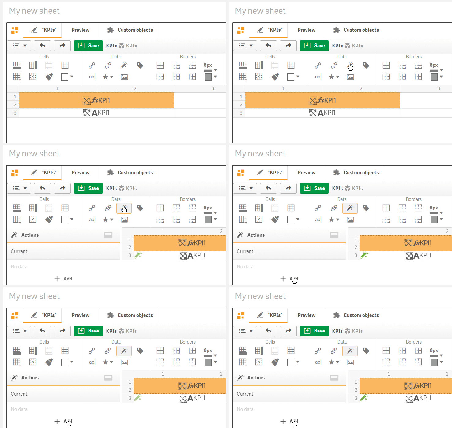
Make dashboards easier to navigate by adding predefined actions to Power KPI objects and individual cells. Users can move between sheets, explore details, open pop-up dialogs, make or clear selections, apply bookmarks, and switch visualization templates. Combine actions to create guided interactions that help users move from a key indicator to the relevant analytical context with fewer clicks.
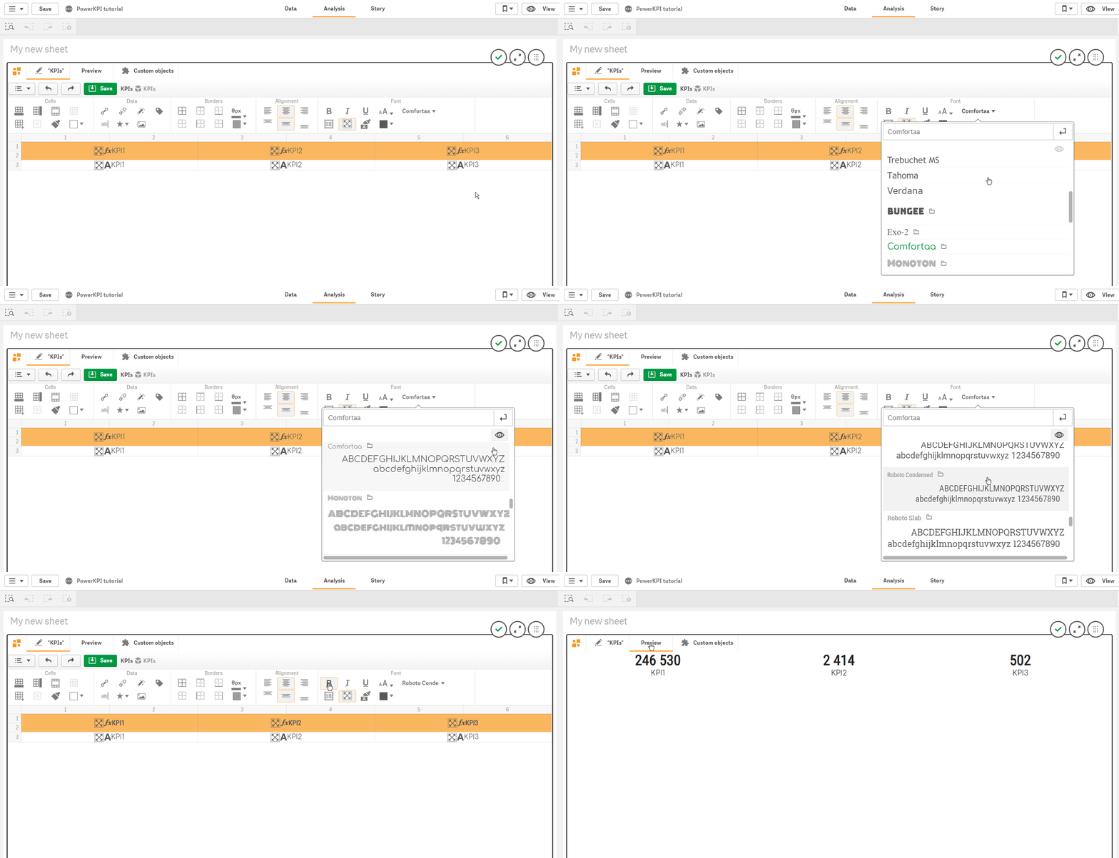
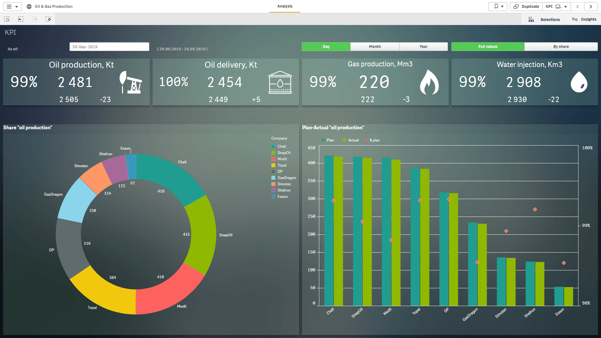
Make key figures more readable and expressive with flexible text formatting, images, and icons. Choose fonts and colors, adjust horizontal and vertical alignment, and use multiline text for longer labels or descriptions. Add icons based on expressions to communicate the context of a metric. Power KPI includes fonts and icon sets that can be extended with your own resources.
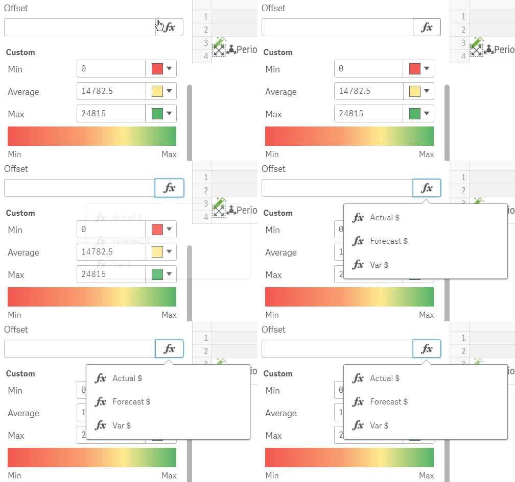
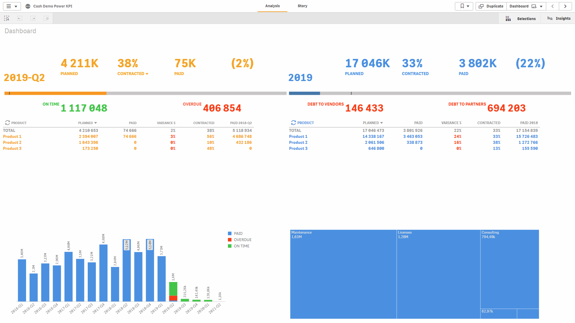
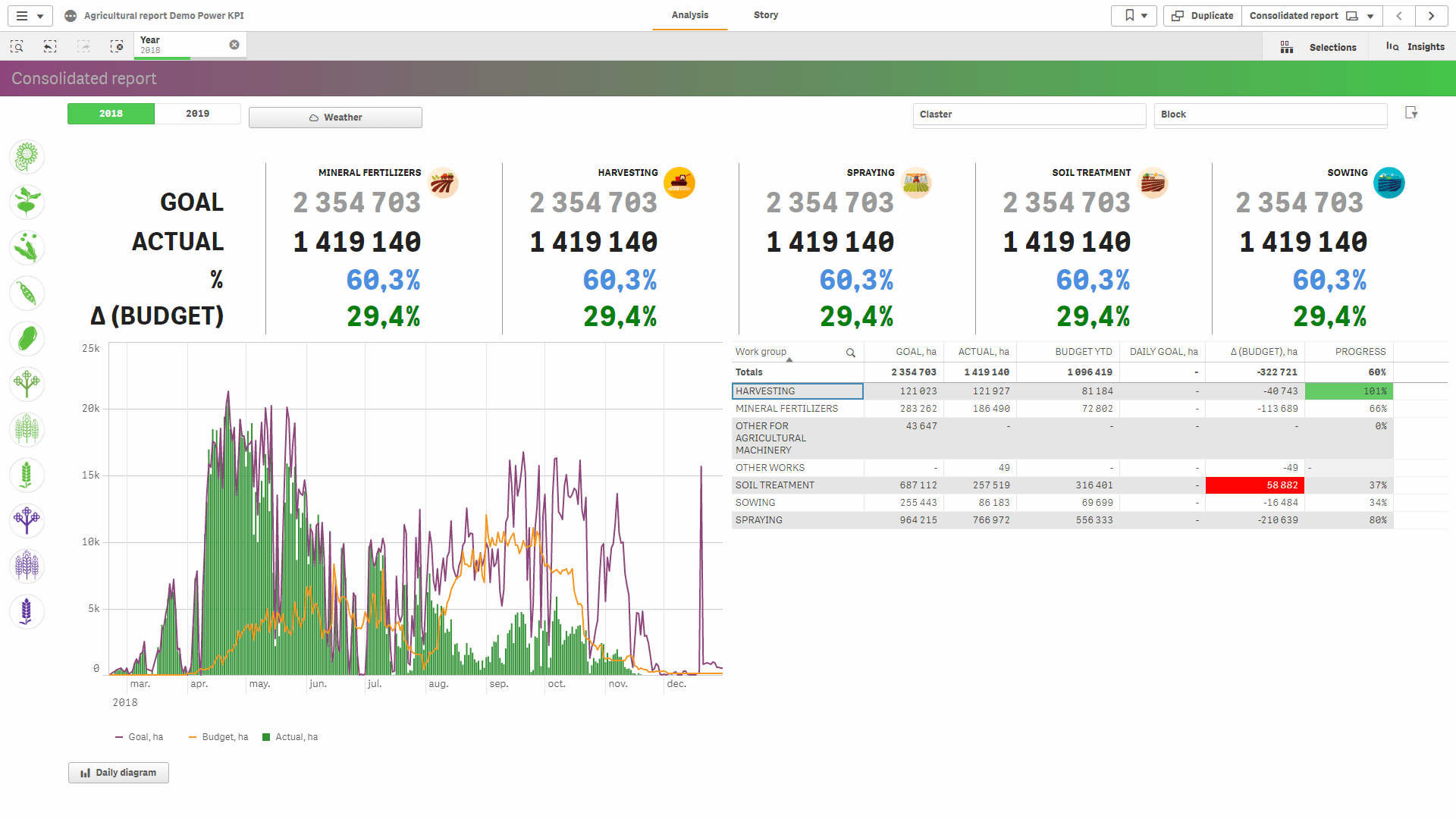
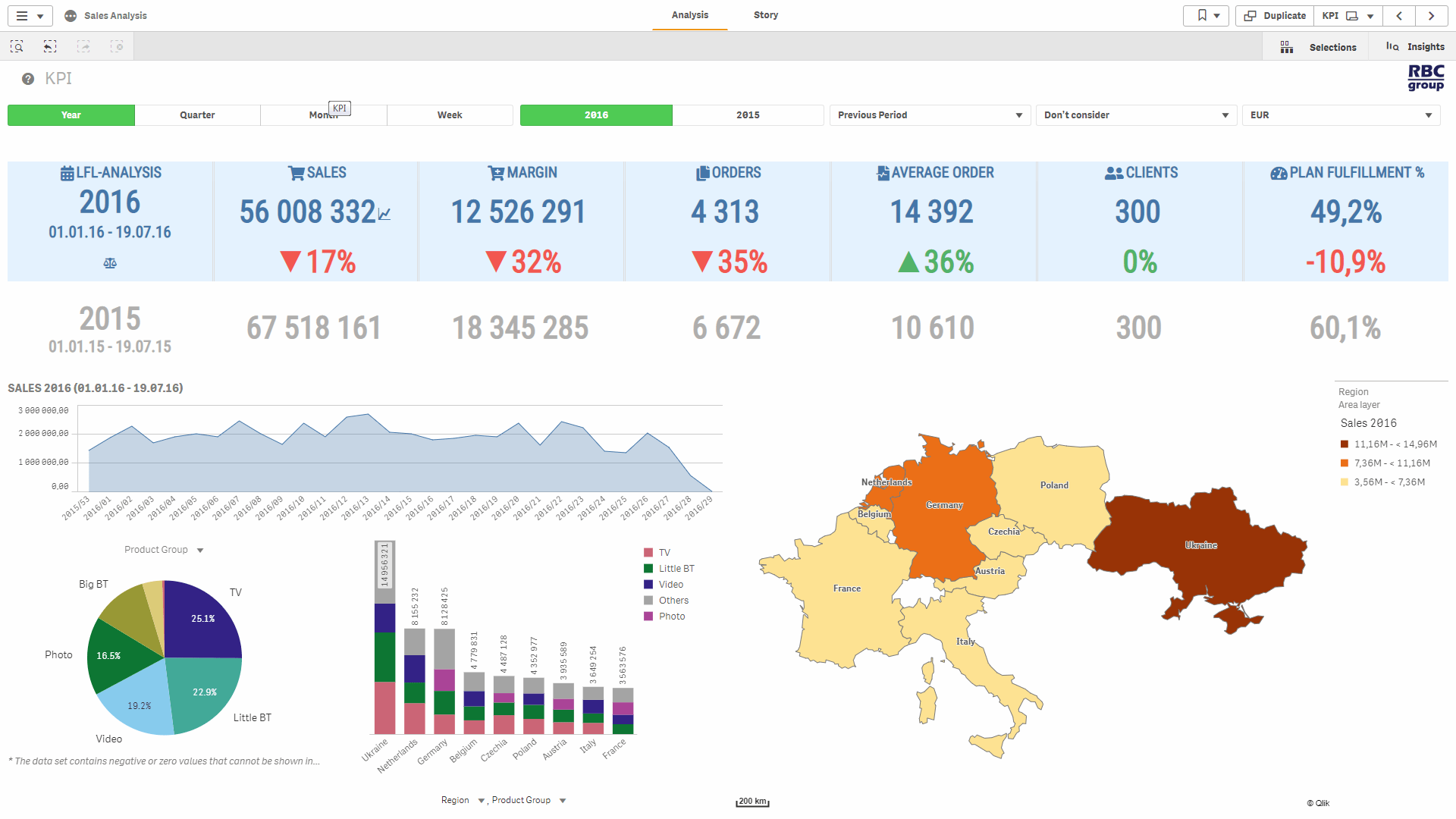
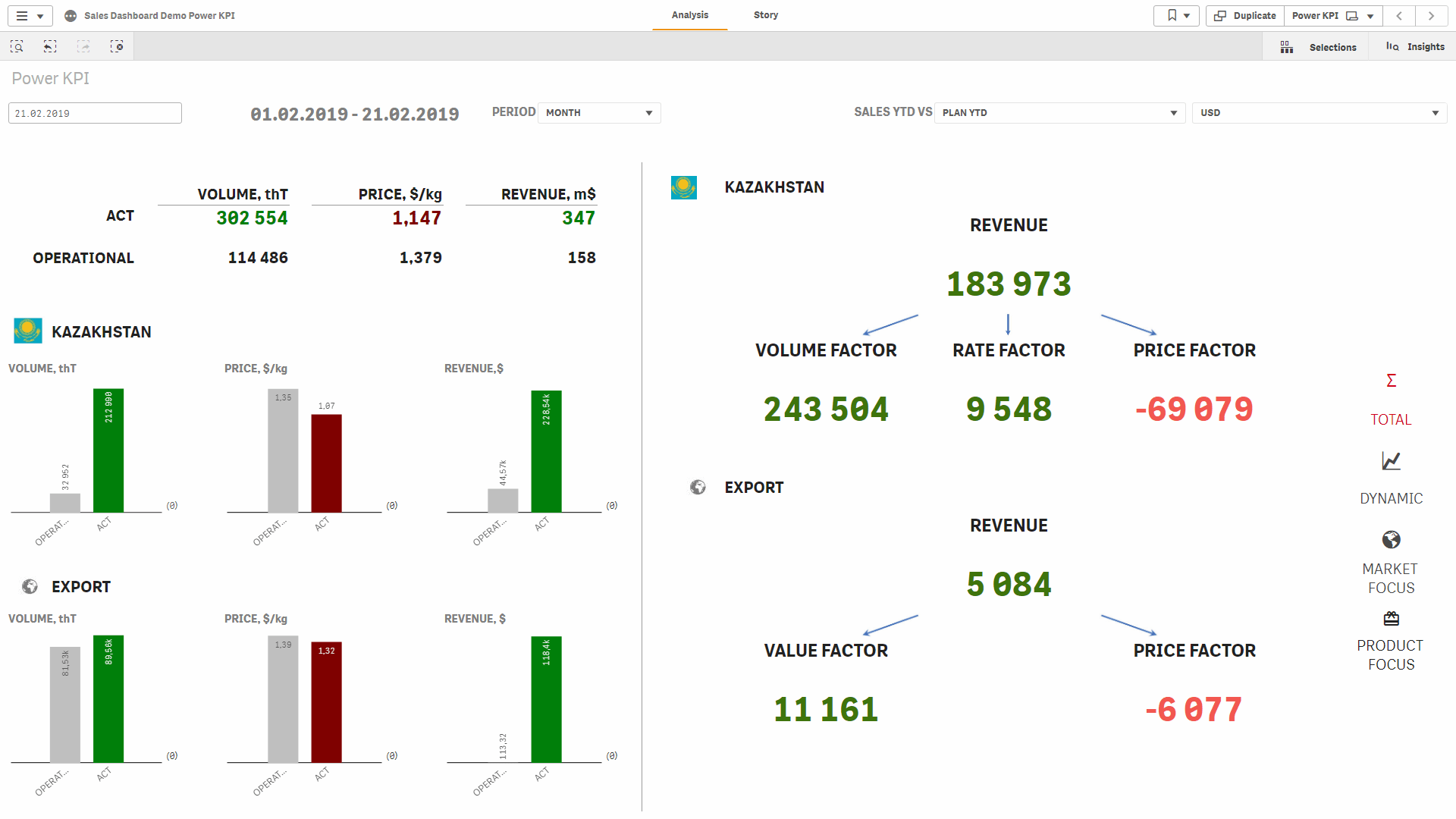
Add compact charts alongside KPI values to provide visual context without taking users away from the dashboard. Use mini charts and bullet charts to help users interpret performance and compare results. Embed Qlik Sense master visualizations within Power KPI views, combining headline figures with supporting charts so users can explore both the summary and the detail in one place.
Give users access to explanations and supporting analysis without overcrowding the main dashboard. Create custom pop-up dialogs and tooltips with HTML-formatted content and embedded Qlik Sense or Power KPI visualizations. Use them to explain how a metric is calculated, provide additional context, or display a detailed view when users interact with a specific value or dashboard element.
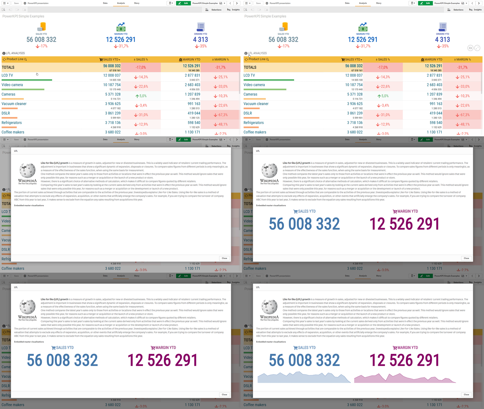
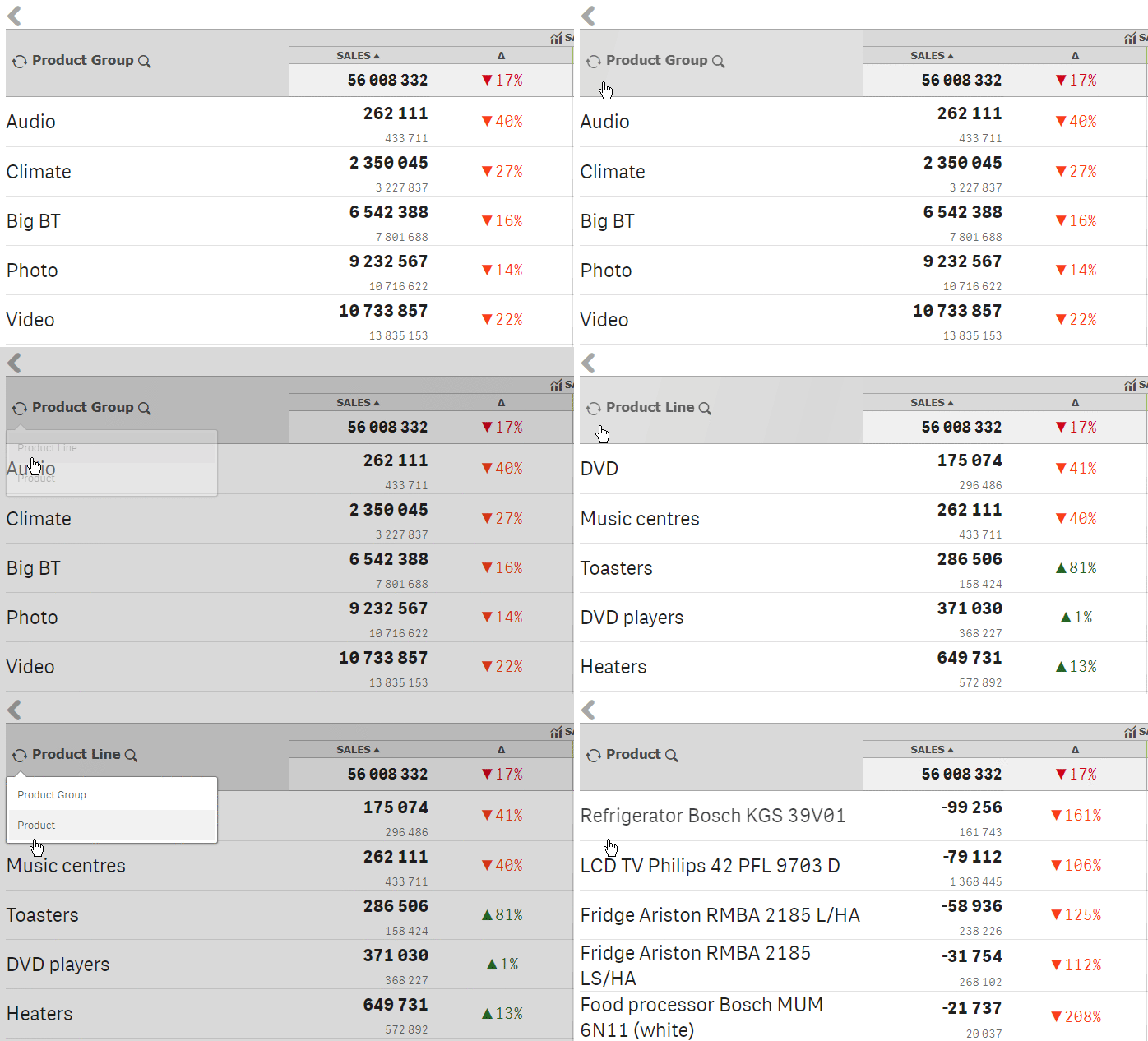
Let users change the analytical perspective within the same visualization by switching between predefined dimensions and measures. Controls displayed alongside column labels allow them to choose the relevant breakdown or metric during analysis. This makes a single view more flexible: users can explore different business questions without navigating to another sheet or asking a developer to modify the dashboard.
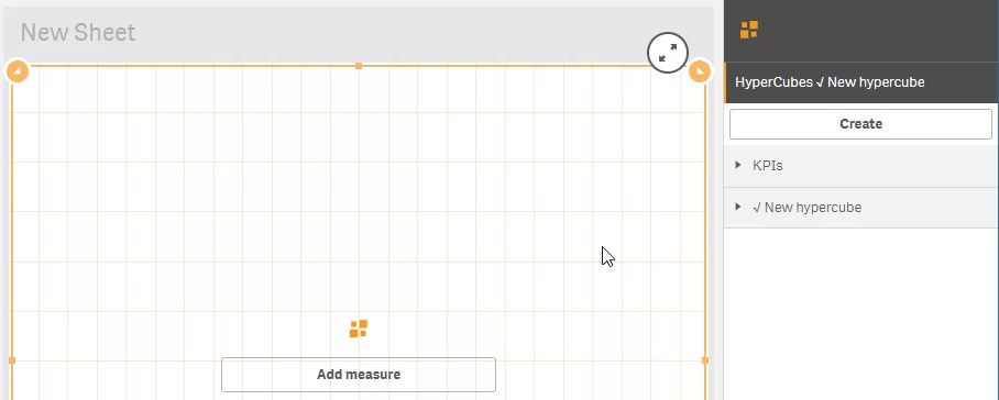
Configure multiple hypercubes within a Power KPI object to support different combinations of dimensions and measures. Switch the data displayed in the same table to an alternative hypercube with a single interaction, while retaining the presentation layout. This allows developers to provide several analytical views within one component and helps users move between related perspectives without adding separate tables to the dashboard.


 Add More Interactivity to Qlik Sense Applications
- Present KPIs in custom cards, lists, and table layouts that reflect how your business uses the data.
- Let users navigate, make selections, and switch analytical views directly within Power KPI visualizations.
- Connect summary indicators with detailed views, so users can explore the figures behind a KPI without overcrowding the main dashboard.
 Make Data Easier to Understand
- Highlight important information using structured tables, multiline headers, colors, and icons that help users interpret business results.
- Explain metrics and provide supporting context through tooltips and pop-up dialogs, helping users understand the dashboard as they explore it.
- Bring related KPIs and supporting visualizations together on one screen, making it easier to compare results and identify areas that need attention.
 Make Dashboard Development Faster and Easier
- Build custom layouts and interactive views within Qlik Sense using a visual editor, reducing the need for separate web development for supported scenarios.
- Combine KPI values, formatting, mini charts, and interactive actions within a single Power KPI component to simplify dashboard construction.
- Design dashboards that guide users through the application, with clear navigation and access to the information relevant to their business questions.
Add More Interactivity to Qlik Sense Applications- Present KPIs in custom cards, lists, and table layouts that reflect how your business uses the data.
- Let users navigate, make selections, and switch analytical views directly within Power KPI visualizations.
- Connect summary indicators with detailed views, so users can explore the figures behind a KPI without overcrowding the main dashboard.
Make Data Easier to Understand- Highlight important information using structured tables, multiline headers, colors, and icons that help users interpret business results.
- Explain metrics and provide supporting context through tooltips and pop-up dialogs, helping users understand the dashboard as they explore it.
- Bring related KPIs and supporting visualizations together on one screen, making it easier to compare results and identify areas that need attention.
Make Dashboard Development Faster and Easier- Build custom layouts and interactive views within Qlik Sense using a visual editor, reducing the need for separate web development for supported scenarios.
- Combine KPI values, formatting, mini charts, and interactive actions within a single Power KPI component to simplify dashboard construction.
- Design dashboards that guide users through the application, with clear navigation and access to the information relevant to their business questions.
The price does not depend on the number of analytics programs.
FREE
99$
/month(annual subscription)
Contact Us

Power KPI is completely free to use with Qlik Sense Desktop.
You will need to purchase a subscription if you plan to use the extension in an enterprise environment. See the “Pricing” page for details.
The extension is also completely free for non-commercial organizations. Contact us to obtain a license.
There is one straightforward licensing model: a subscription.
See the “Pricing” page for details.
Power KPI is completely free to use with Qlik Sense Desktop.
Power KPI is completely free to use with Qlik Sense Desktop.
If you want to try the extension on a Qlik Sense Enterprise server before purchasing a subscription, you need to install it and activate the trial version.
See “How Do I Activate Power KPI?” for details.
Download the extension ZIP file. The installation process depends on the environment in which you plan to install it.
Загрузите zip-файл с расширением. Процесс установки зависит от среды, в которой вы собираетесь его установить.
Для десктопной версии Qlik Sense:
1. Откройте окно проводника Windows и перейдите к ..\Users\\Documents\Qlik\Sense\Extensions.
2. Создайте новую папку и дайте ей подходящее имя.
3. Извлеките загруженный zip-файл в новую папку.
After importing the extension into your Qlik Sense Enterprise server through the QMC, you need to activate it.
Activation is not required in Qlik Sense Desktop.
Activation must be performed by a RootAdmin user.
There are two options for activating the extension: online and offline.
Online Activation
To activate the extension, follow these steps:
First, create an empty application on the server and add the extension to a sheet.
Open the About section in the properties panel.
View screenshot
You should see the extension version alongside the message “Valid license is missing.”
Click Activate to start the activation process.
The activation dialog should appear after you click Activate.
View screenshot
On the first page, read the license agreement and scroll to the end of the text.
View screenshot
At the end of the license agreement, select I accept the license and click Next.
On the next page, enter the activation key you received when purchasing the product, then click Next to continue activation. Leave the Activation key field empty if you are installing the trial version.
View screenshot
After successful activation, you will see the message “Congratulations! Power KPI has been successfully activated!”
View screenshot
Offline Activation
If you do not have an internet connection or encounter a problem during online activation, you can use offline activation.
Repeat steps 1–5 from the “Online Activation” section above. These steps are omitted here for brevity.
Enter your activation key on the corresponding page of the activation dialog and select Offline activation. Leave the Activation key field empty if you are installing the trial version. Click Next to continue offline activation.
View screenshot
Follow the instructions on the next page: copy the displayed text and email it to ext@rbcgrp.com.
View screenshot
You will then receive an email containing a valid license. Paste the license contents into the text field labeled Paste received license content here, then click Upload license.
View screenshot
After clicking Upload license, you will see the message “Congratulations! Power KPI has been successfully activated!”
View screenshot
If you have any further questions, contact our support team for help with the activation process.активации.
The subscription includes technical support for the product and all updates and enhancements we develop. We guarantee product support for new versions of Qlik Sense.
Two weeks after the release of a new Qlik Sense version.
Product support includes reviewing and resolving support requests, fixing bugs, assistance with product installation, and webinars.
Yes.
Yes.
ТТО

